
# How to Use the Home Decor Colour Trend for 2025 to Stay Ahead of Style
2025 is shaping up to be a bold yet balanced year in home decor. Colour plays a starring role — and instead of choosing between neutrals and brights, this year embraces both. Think warm earthy tones paired with modern jewel accents, soothing nature-inspired palettes, and soft pastels washed in cozy, lived-in warmth.
The goal? Curate a home that feels expressive, grounded, and elevated — where colour adds emotion, personality, and just the right amount of drama. You don’t have to repaint your whole house to stay ahead of style; thoughtful pops, layered tones, and smart accents can do the magic.
—
## Explore the 2025 Colour Themes
Before picking shades, let’s break down the year’s defining colour categories. These tones blend comfort, nature, innovation, and quiet luxury.
### Top 2025 Colour Trends:
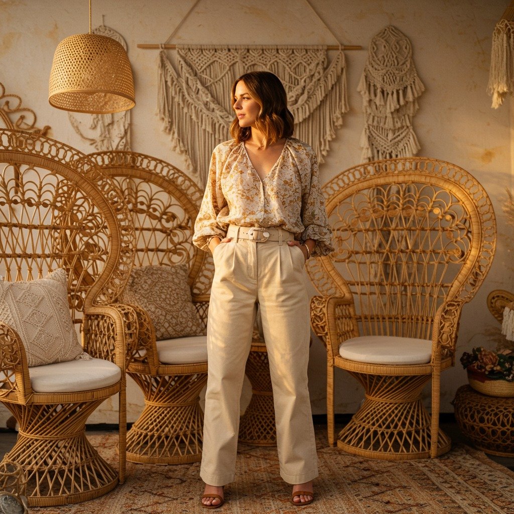
– **Warm Neutrals:** oatmeal, buttercream, almond, sand
– **Earthy Browns & Terracotta:** warm clay, caramel, rustic sienna
– **Soft Nature Greens:** sage, olive, eucalyptus mist
– **Bold Jewel Pops:** emerald, deep plum, sapphire accents
– **Vintage Pastels:** dusty rose, soft apricot, misty lavender
– **Charcoal & Ink:** grounding dark hues for elegant contrast
2025 is about harmony — earthy warmth meets intentional statement colours.
—
## Start With a Warm Neutral Foundation
Warm neutrals continue dominating interiors because they create calm, timeless backdrops. If your space already leans neutral, you’re halfway there.
Use shades like:
– Creamy oatmeal walls
– Soft beige or latte upholstery
– Warm white drapery
– Taupe cushions and throws
These colours work with natural textures like linen, stone, and wood, making your base feel cozy and modern.
—
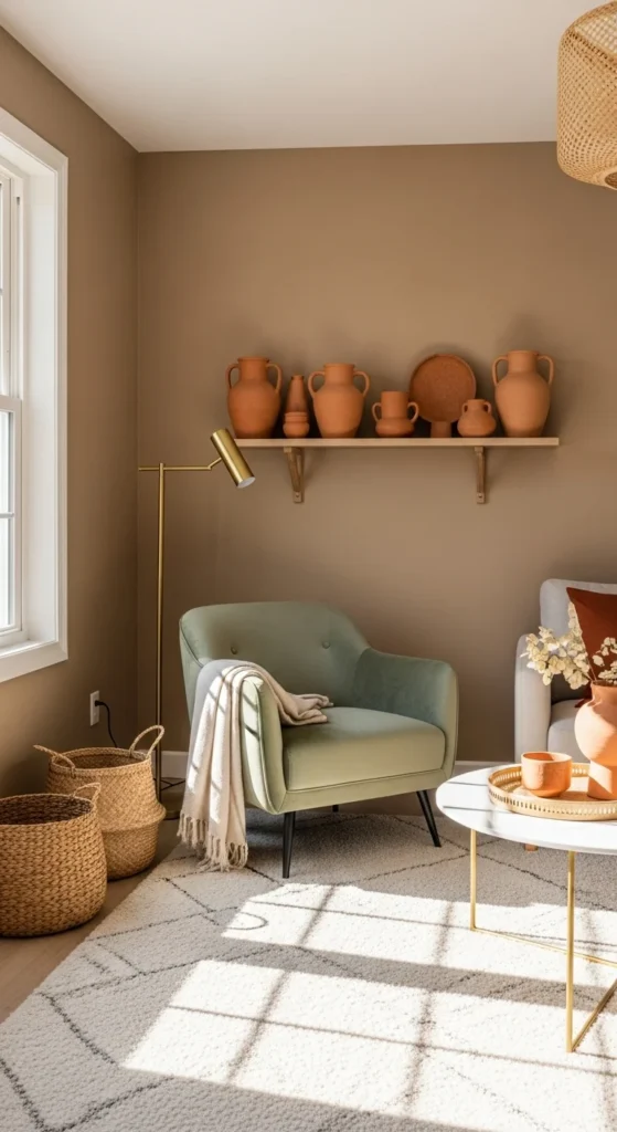
## Layer Earth Tones for Depth
Once your base is set, layer warm, grounded tones to add dimension. Earth shades bring a sense of comfort and nature indoors.
### Try Adding:
– Terracotta planters
– Rust or caramel throw pillows
– Wooden furniture with matte finishes
– Clay-toned vases & decor bowls
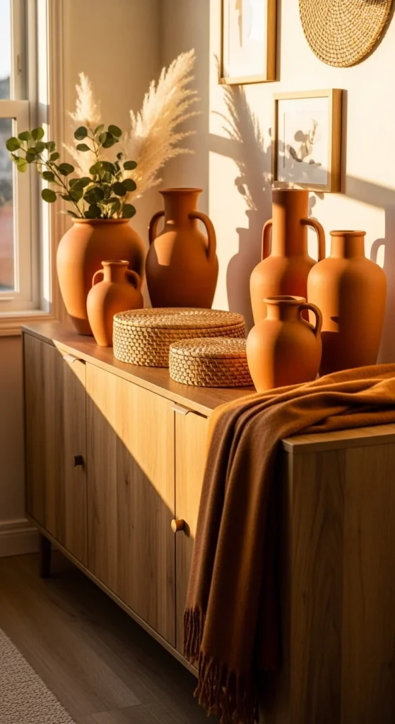
These colours invite tranquility — perfect for cozy living rooms, reading corners, or dining spaces.
—
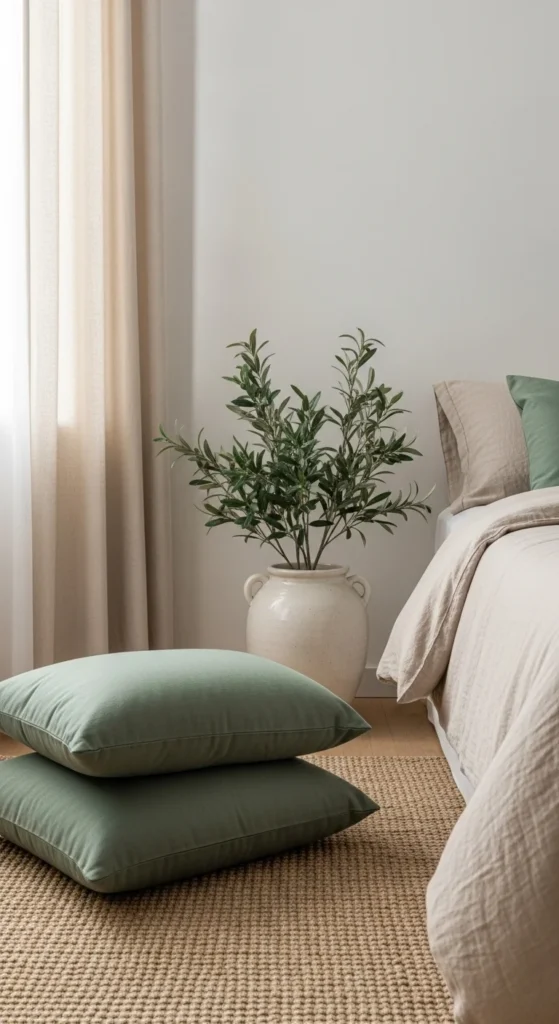
## Bring in Trendy Greens for Balance
Green is *the* nature shade of 2025. It feels fresh, calming, and refined — especially when paired with warm neutrals.
### Use green in:
– Sofa chairs or bench cushions
– Wall art and textiles
– Olive or eucalyptus plants
– Decorative books and table accents
For renters, swapping in green throw pillows or botanical prints is easy and impactful.
—
## Add Jewel-Tone Accents for Luxury
A trend gaining momentum in 2025? Sophisticated jewel accents — done subtly.
Think:
– Emerald velvet cushions
– Sapphire ceramic bowls
– Deep plum candle holders
– Gold or brass hardware to enhance jewel tones
Even one dramatic piece — like a jewel chair or art print — elevates a room instantly.
### Designer Tip:
Use jewel tones as small accent pops, not scattered everywhere. Keep it intentional.
—
## Mix Modern Pastels for Soft Character
Pastels are back, but not sugary sweet — they’re creamy, muted, and elegant. The best way to introduce them? Textiles and art.
### Trending pastels:
– Mist rose
– Dusty apricot
– Muted lavender
– Smoky sky blue
Pastels bring freshness and youth into neutral rooms while keeping things soft.
—
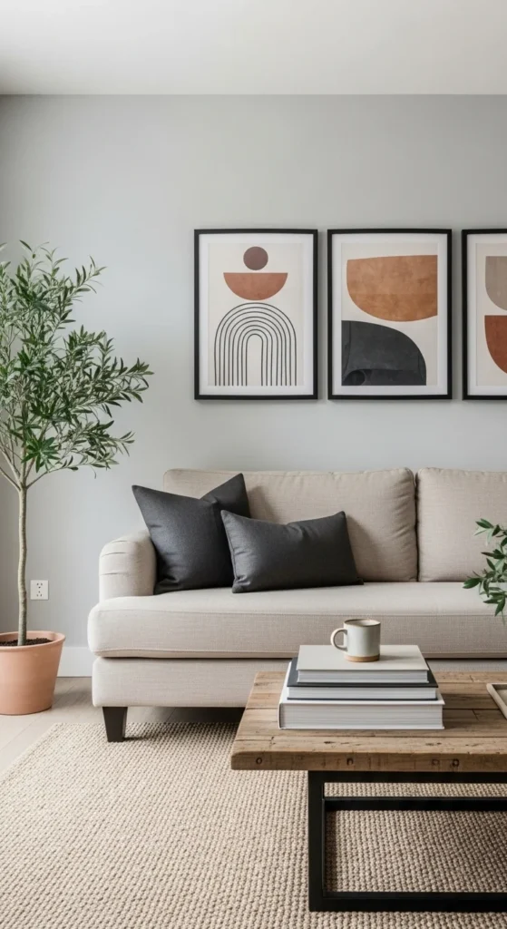
## Ground Everything With Dark Contrast
Even soft, soothing palettes need grounding. Add moments of depth for balance.
### Dark Accent Options:
– Charcoal throw pillows
– Matte black frame gallery wall
– Black ceramic vases
– Deep walnut wood accents
Contrast creates structure and sophistication.
—
## Don’t Forget Texture & Materials
Colour doesn’t stand alone — texture makes it feel rich and dimensional.
### Combine:
– Linen & cotton
– Woven jute rugs
– Matte stone decor
– Wood finishes (oak, walnut, maple)
– Velvet accents for depth
Think: touchable surfaces + layered warmth.
—
## Final Thoughts
2025 home colour trends are all about warmth, emotion, and expression. With earthy foundations, soft natural tones, and curated pops of jewel vibrance, you can stay ahead of the style curve while still creating a peaceful, welcoming space.
Save this guide before your next room redesign — your future self (and your future walls!) will thank you. 🎨🏡✨
**Pin this 2025 colour trend guide for inspiration!**
Leave a Reply