
Bold patterns can bring energy, personality, and instant charm to any room—but only when used thoughtfully. Too much pattern can feel chaotic, while the right balance creates a polished, stylish space that feels intentional. Whether you’re drawn to florals, geometrics, stripes, or abstract prints, you can absolutely decorate with confidence.
This guide walks you through simple steps to incorporate bold patterns beautifully, without overpowering your home.
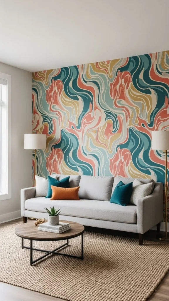
Start with One Focal Pattern
Before layering prints, choose one dominant pattern to anchor the room. This becomes your visual foundation and helps everything else fall into place.
Your focal pattern could be:
- An accent wall
- A large area rug
- A bold set of curtains
- A patterned sofa or armchair
- A large-scale framed textile
Once you choose that hero piece, build around it with softer elements.
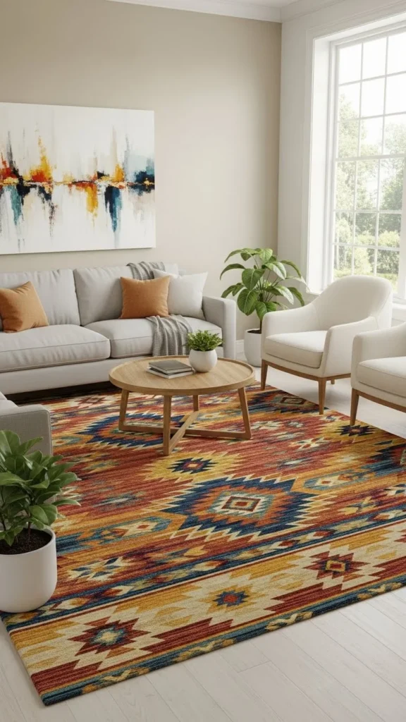
Keep the surrounding décor calm—solid pillows, simple art, and neutral furniture allow the focal pattern to shine.
Balance Bold Prints with Neutral Tones
Bold patterns need breathing room. Neutrals create that calming balance and prevent a space from feeling busy.
Try pairing bold prints with:
- White or cream walls
- Soft beige or grey sofas
- Wood accents
- Plain bedding
- Minimalist lighting
This creates visual focus while keeping the room open and airy.
Neutrals don’t mean boring—they allow your bold décor to stand out in the best way.
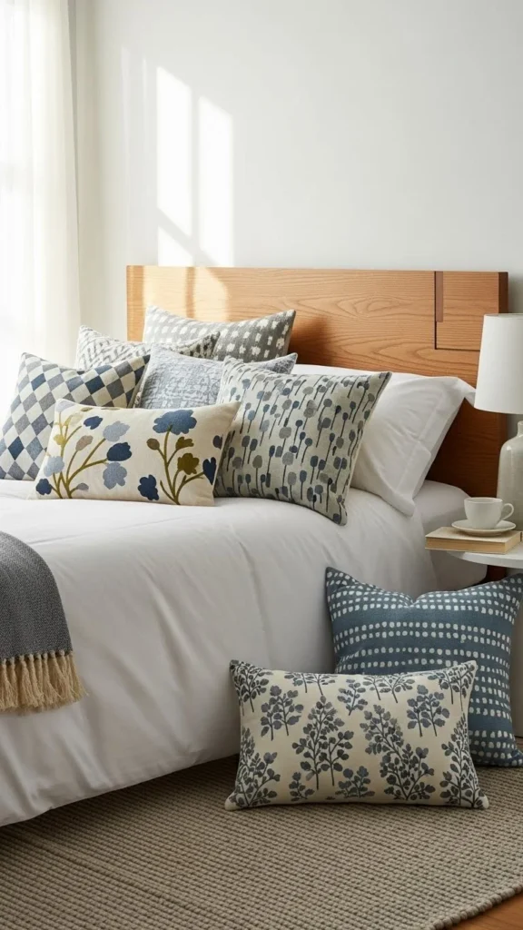
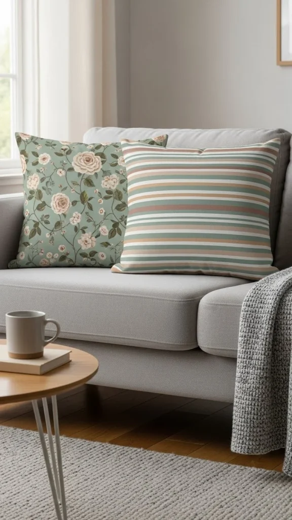
Use Patterns in Small, Repeated Touches
If you’re nervous about large-scale patterns, start small. Repetition brings cohesiveness without overwhelming the room.
Ideas for subtle patterned accents:
- Throw pillows
- Lampshades
- Small ottomans
- Picture frames
- Table runners
- Plant pots
These touches distribute pattern in a gentle, controlled way, helping the room feel balanced.
Stick to a Limited Color Palette
One of the easiest ways to keep bold patterns from feeling chaotic is to stick to a defined color palette. Even if your patterns differ in scale or style, shared colors make them feel connected.
Pick:
- One main color
- One secondary color
- One optional accent color
Then use them strategically across patterns.
This simple trick instantly creates harmony, even when mixing prints.
Mix Pattern Scales for Harmony
Using patterns of different sizes helps the eye move comfortably through the space.
A good rule:
- One large-scale pattern
- One medium-scale pattern
- One small-scale pattern
For example:
- Large: patterned rug
- Medium: patterned throw blanket
- Small: patterned tray or coasters
This creates a layered, designer look without visual overload.
Use Patterns in Low-Commitment Décor First
If you’re experimenting, try patterns you can easily replace later.
Low-risk pattern options:
- Pillow covers
- Peel-and-stick wallpaper
- Area rugs
- Window treatments
- Temporary art prints
These allow you to play with bolder looks without long-term commitment.
Give Patterns Space to “Rest”
When adding bold pattern, include areas of visual rest so the eye isn’t overwhelmed.
Ways to create rest:
- Keep some walls solid
- Use clear surfaces (like glass tables)
- Include negative space around art
- Choose furniture with simple lines
Think of it like fashion: patterned tops look great with simple jeans for a reason.
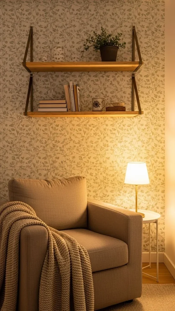
Use Patterned Décor to Highlight Key Areas
Pattern can be used strategically to draw attention where you want it.
Use it to highlight:
- Entryways
- Reading corners
- Dining nooks
- Fireplace walls
- Office desks
Bold patterns act like a spotlight—use them to emphasize your favorite spaces.
Combine Patterns with Texture for Balance
Patterns bring visual energy, but textures bring warmth.
Mix patterns with:
- Woven baskets
- Chunky knits
- Velvet pillows
- Jute rugs
- Wood furniture
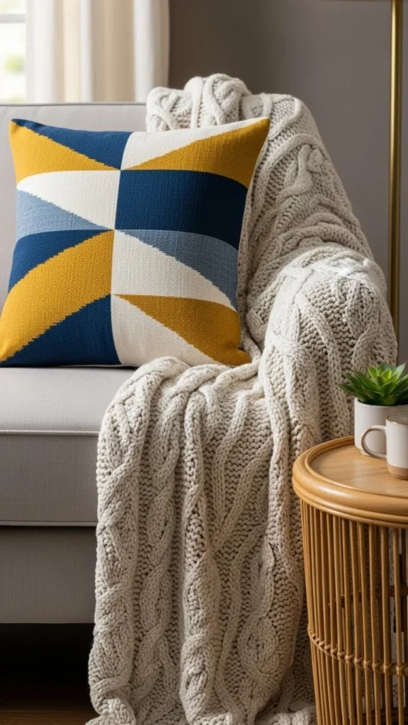
Texture softens patterns and creates a cozy, curated look.
Final Takeaway
Bold patterns don’t have to feel intimidating—they just require balance. By choosing one focal pattern, sticking to a clear color scheme, mixing pattern scales, and grounding your look with neutrals and texture, you create a space that feels exciting and harmonious.
Save this guide for later, and start experimenting with patterns that make your home feel personal, stylish, and full of life!
Leave a Reply