
Colour-coordinated bookshelves are more than a trendy design idea—they’re a simple way to bring harmony, beauty, and instant “wow” factor into your space. By arranging your books by hue, your shelves turn into functional artwork, blending order with personality. Whether you love bold rainbow vibes or soft tonal gradients, colour styling is an easy upgrade that transforms any room.
Here’s how to style a bookshelf by colour so it feels intentional, polished, and visually breathtaking.
Start by Gathering & Sorting Your Books
The first step is taking everything off your shelves and sorting your books into colour families. This helps you see what you’re working with before creating your gradient or grouped arrangement.
Sort into:
- Reds
- Oranges
- Yellows
- Greens
- Blues
- Purples
- Blacks
- Whites
- Neutrals (browns, greys, creams)
You may have books that don’t perfectly fit a colour category—that’s okay. Place them with their closest hue or reserve them for styling accents later.
Choose Your Colour Style: Gradient or Blocked
Colour-styled bookshelves usually fall into two design categories:
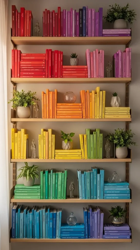
1. Gradient (Rainbow)
Books flow seamlessly from one colour to the next—think ROYGBIV.
This creates a striking, artistic impact and works beautifully in modern spaces.
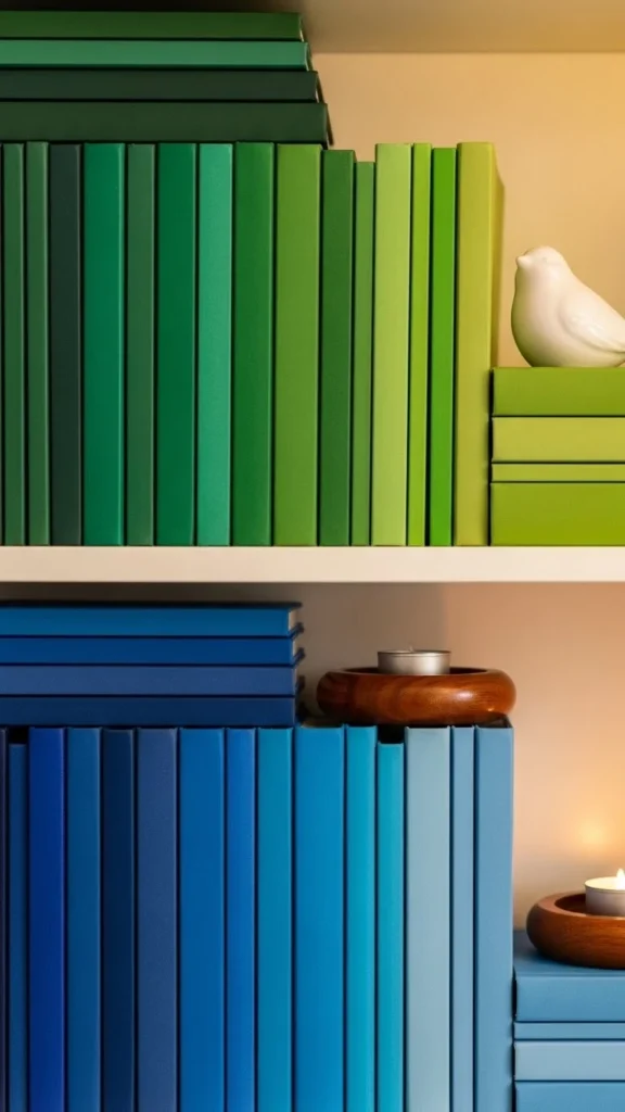
2. Blocked Colours
Each shelf or section focuses on one color family.
This feels structured, calm, and perfect for minimalist or tonal homes.
Neither option is “better”—it’s all about what fits your style and space.
Start With the Strongest Colour Sections
Begin building your arrangement by placing your most prominent colour group first. This gives you an anchor and helps balance the overall look.
If doing gradient:
- Start with red or white, depending on your preferred flow.
- Move through the spectrum gradually.
If doing blocks:
- Place your boldest colour either in the centre or on a middle shelf to ground the look.
This prevents the layout from feeling top-heavy or uneven.
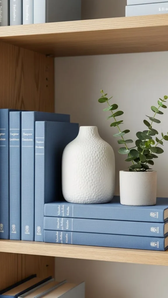
Mix in Decor Pieces to Add Texture & Spacing
Adding decor helps break up heavy rows of books and keeps the design feeling airy and intentional.
Use:
- Small plants
- Ceramic vases
- Sculptural objects
- Picture frames
- Bookends
- Candles
Try to match decor pieces to the colour family around them (e.g., sage-toned vase in the green section). This enhances cohesion and calms visual clutter.
Play With Book Orientation for Extra Visual Interest
You don’t have to keep every book standing straight up. Mixing orientations helps create rhythm and prevents your shelf from looking too uniform.
Try:
- Horizontal stacks
- Vertical rows
- Leaning a book lightly against decor
- Alternating between tall and short books
Horizontal stacks also make great pedestals for decorative objects.
Use Neutrals Strategically to Balance the Palette
Neutral-coloured books—whites, creams, tans, greys, and blacks—are excellent tools for grounding your design.
Use them to:
- Transition between bright colour groups
- Add calmness to loud hues
- Create visual rest zones
- Support monochromatic sections
If your shelf starts to feel overwhelming, adding a few neutrals resets the balance beautifully.
Make It Functional: Keep Favourite Books Accessible
Colour styling doesn’t mean sacrificing practicality.
You can still keep your favourite reads or frequently used books within easy reach.
Tips for functionality:
- Place your most-used books at eye level
- Store lesser-used ones higher or lower
- Keep series or categories together within their colour zone
- Use a decorative basket for “active reads” if their colours don’t match the palette
This ensures your bookshelf remains both stunning and usable.
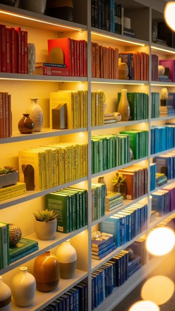
Add Lighting to Highlight the Colours
Lighting brings your colour styling to life, especially in the evenings.
Use:
- LED strip lights along the shelf edges
- Small puck lights
- A nearby floor or table lamp
- Warm white bulbs for soft ambience
Lighting emphasizes the gradient and makes your bookshelf feel like a curated display.
Step Back & Adjust for Flow
Once everything is in place, take a step back and look at the overall balance. You may need to:
- Shift colours slightly for smoother transitions
- Remove overcrowded sections
- Add a small décor piece where the shelf feels empty
- Rearrange heights for visual rhythm
Cohesiveness comes from flow—not perfection.
Final Takeaway
Colour-styling your bookshelf is an easy, creative way to add order and aesthetic beauty to your space. With sorted colours, thoughtful decor, mixed orientations, and warm lighting, you can turn a simple shelf into a captivating design moment.
Save this article for later so you can create your own stunning colour-coded bookshelf!
Leave a Reply