
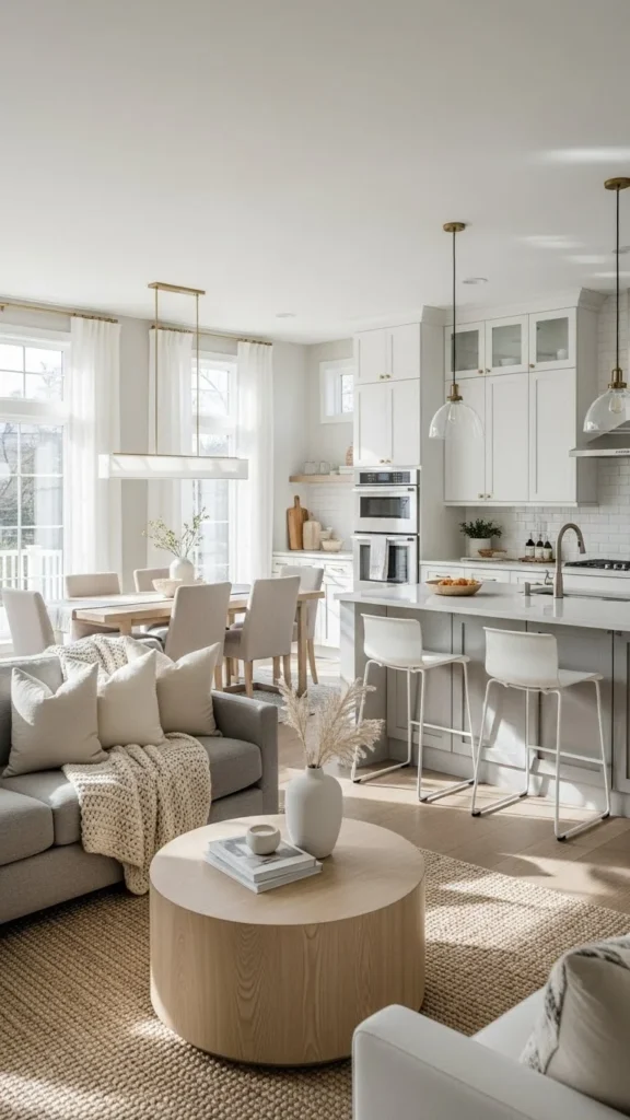
Open floor plans are beautiful—they’re bright, airy, spacious, and perfect for modern living. But decorating them can be tricky. Without thoughtful color choices, your open layout can feel scattered, overwhelming, or disconnected. The key is selecting a colour palette that flows effortlessly from one zone to the next while still creating definition and visual harmony.
Here’s how to choose a colour palette that brings your open floor plan together beautifully.
Start With Your Main Foundation Colour
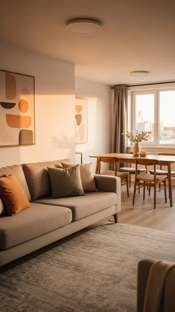
Every cohesive palette begins with a dominant color that sets the tone for the entire space. This colour should work across living, dining, and kitchen areas because it forms the visual base.
Ideal foundation colours:
- Soft whites
- Warm beiges
- Light greys
- Creamy taupes
- Muted greige tones
These shades help the whole space feel unified and bright.
Your foundation colour should appear on most walls and in key décor elements like curtains, rugs, and large furniture pieces.
Choose 2–3 Accent Colours That Repeat Throughout the Space
Once you have your foundation colour, choose a few accent colours to weave through the various zones. Repetition is essential to making an open layout feel intentionally designed.
Great accent options:
- Deep navy
- Sage green
- Charcoal grey
- Terracotta
- Mustard gold
- Soft blush
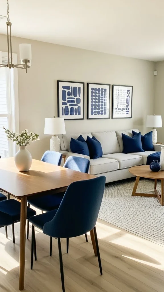
Repeating colours doesn’t make things boring—it makes the space cohesive and calming.
Use Colour to Define Zones Without Breaking Flow
Open floor plans benefit from subtle colour shifts that create separation while still feeling connected.
Ways to define zones with colour:
- A darker rug in the living room
- A statement wall in the dining area
- Bar stools that echo kitchen accents
- Art that brings one colour from room to room
You’re not creating hard borders—you’re using soft visual cues to distinguish spaces.
Keep your accent colours aligned so the transition feels seamless.
Consider Undertones—They Matter More Than You Think
Undertones determine whether colours complement or clash.
Warm undertones:
- Beige, cream, warm white
- Terracotta, mustard, olive
- Natural wood, brass, warm metals
Cool undertones:
- Soft grey, crisp white
- Navy, charcoal, black
- Chrome, stainless steel
Mixing warm and cool can work beautifully—but only when done intentionally.
Ensure your foundation colour’s undertone matches or harmonizes with your accents for consistent flow.
Use Large Pieces to Anchor Colour & Small Items to Layer It
In open floor plans, larger décor pieces create colour stability.
Large pieces:
- Sofa
- Area rugs
- Curtains
- Dining chairs
- Kitchen bar stools
Smaller accents:
- Pillows
- Throws
- Lamps
- Artwork
- Vases
Anchoring with large neutrals gives you flexibility to play with accents without overwhelming the room.
Bring Colour Into the Kitchen Thoughtfully
Since the kitchen is part of the open floor plan, it needs to visually connect to the living and dining areas.
Easy ways to weave colour into the kitchen:
- Coloured bar stools matching your living room palette
- Coordinating backsplash tones
- Countertop accessories in accent colours
- Pendant lighting with matching finishes
Keep your kitchen both functional and harmonious with the rest of the space.
Use Texture to Support Your Colour Story
Texture brings depth to your palette without introducing more actual colour.
Try layering:
- Woven baskets
- Linen curtains
- Velvet pillows
- Jute rugs
- Wood furniture
Texture helps each zone feel inviting and intentional—especially in large, open areas where colour must remain balanced.

Texture supports your palette while keeping the space visually interesting.
Test Colours in Natural Light Across the Entire Space
The challenge with open layouts? Light hits different zones differently.
Always test:
- Paint swatches in multiple areas
- Colour samples morning and evening
- How artificial lighting affects tone
What looks warm in the kitchen might look too cool in the living room.
Testing helps you pick colours that stay consistent across changing light.
Let Wood Tones & Metals Be Part of Your Palette
Your colour palette isn’t just paint—wood and metal finishes matter too.
Wood tones:
- Blonde: coastal, airy
- Walnut: warm, rich
- Espresso: dramatic, grounding
Metals:
- Brass: warm and elegant
- Black: modern and bold
- Chrome: cool and crisp
If these tones repeat across the open layout, your entire space will naturally flow.
Final Takeaway
Choosing a colour palette for an open floor plan doesn’t have to feel overwhelming. When you start with a strong foundation colour, repeat a few key accent shades, use texture for warmth, and allow colour to define zones, your home feels unified and beautifully connected.
Save this guide for later and build a colour palette that makes your open space feel effortlessly cohesive!
Leave a Reply