
Choosing the right paint colour can completely transform a room—making it brighter, cozier, larger, or more stylish with just a few brush strokes. But with endless shades on the market, it can feel overwhelming to know where to start. The truth is, choosing paint isn’t complicated once you understand how colour interacts with light, furniture, and the personality of your home.
If you want your home to feel intentional and beautifully coordinated, this guide breaks down exactly how to choose paint colours that make every room pop.
Understand Lighting Before Choosing Colours
Lighting is the biggest factor in how paint looks. Natural light, bulbs, and even room direction can dramatically shift a colour’s tone.
Here’s how light affects paint:
- North-facing rooms: cooler, softer light → colours may look muted
- South-facing rooms: warm, strong light → colours appear richer
- East-facing rooms: warm mornings, cool afternoons
- West-facing rooms: warm evenings, cooler mornings
Always test paint swatches on multiple walls and look at them throughout the day. Light changes everything.
Choose a Colour Palette That Matches the Room’s Mood
Every colour carries emotion. Pick colours based on how you want the room to feel.
Great choices by mood:
- Calming: soft blues, muted greens, warm neutrals
- Energizing: vibrant yellows, coral, bold teal
- Cozy: terracotta, deep plum, warm beige
- Fresh: crisp white, sage, sky blue
Think about the room’s purpose—bedrooms often suit soft tones, while kitchens or offices benefit from pops of energy.
Use the 60-30-10 Rule for Perfect Balance
This timeless interior design rule helps you create a cohesive colour scheme without overthinking it.
- 60% main colour → walls
- 30% secondary colour → furniture or large décor
- 10% accent colour → pillows, art, accessories
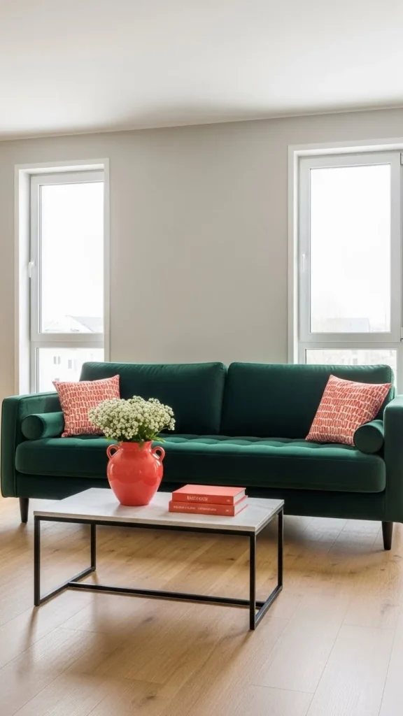
This makes every room feel intentional and visually balanced.
Consider Undertones—They Matter More Than You Think
Two greys can look completely different depending on their undertones. The same goes for whites, blues, and greens.
Common undertones include:
- Blue
- Yellow
- Pink
- Green
- Purple
A grey with blue undertones feels cool and crisp, while a grey with warm undertones feels cozy. Always compare colours side-by-side so undertones become clear.
Let Your Furniture Guide Your Colour Choice
Paint should support your décor—not fight it.
Before choosing a colour, look at:
- Rugs
- Sofa fabric
- Wood tones
- Artwork
- Curtains
Pick paint colours that complement what you already own.
For example:
- Warm furniture pairs well with creamy whites or earthy tones.
- Cool-toned furniture works beautifully with muted blues or crisp greys.
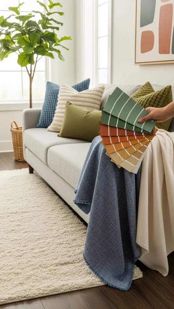
Match your paint to your décor—not the other way around.
Try Bold Colours on Accent Walls or Small Spaces
If you’re craving colour but not ready to commit fully, accent walls are a great option.
Perfect spots for bold colours:
- Behind a bed
- A dining room wall
- A hallway entry
- A reading nook
Small spaces like powder rooms can also handle deep or vibrant shades beautifully because they create an unexpected design moment.
Use Neutrals Strategically
Neutrals make a room feel open, airy, and timeless. But not all neutrals are created equal.
Types of neutrals:
- Cool neutrals → grey, taupe, icy white
- Warm neutrals → beige, cream, greige
- Dramatic neutrals → charcoal, espresso, navy
Warm neutrals create inviting spaces, while cool neutrals feel clean and modern.
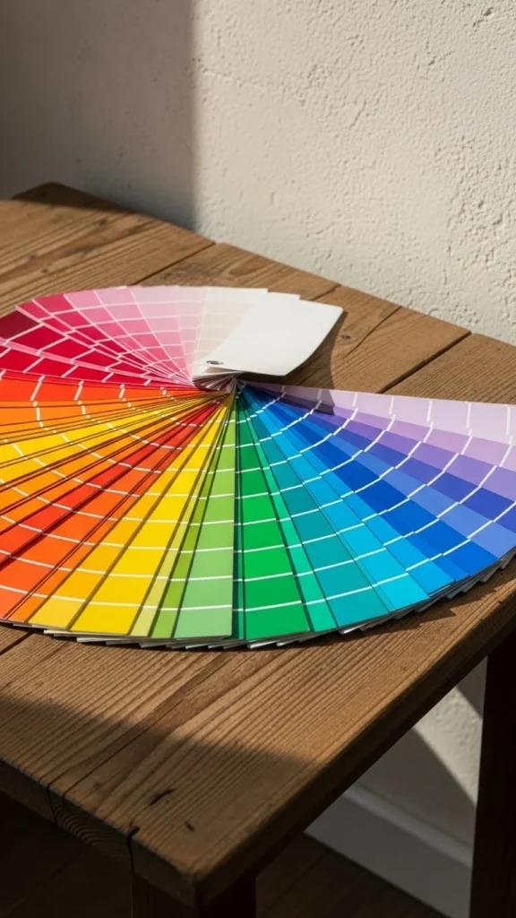
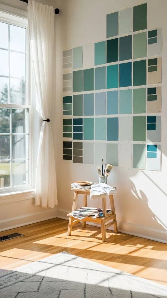
Sample Paint the Right Way
Testing paint isn’t optional—it’s essential.
Best sampling tips:
- Paint large swatches (12×12 inches or more).
- Place them in multiple locations.
- View them at sunrise, midday, and night.
- Compare swatches against your furniture.
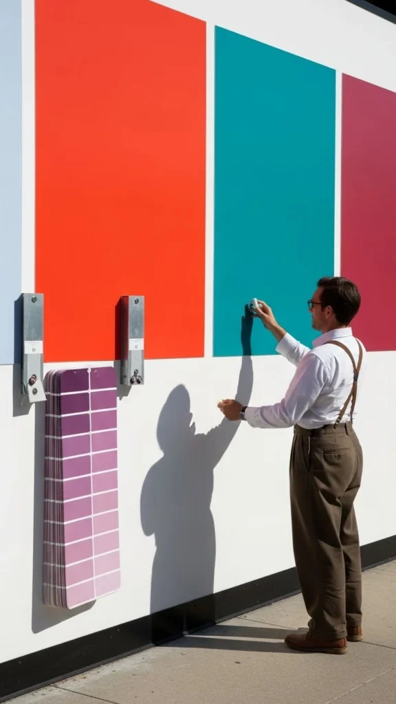
This eliminates surprises after painting the whole room.
Use Colour to Change a Room’s Shape
Paint isn’t just decorative—it can change how a room feels physically.
Try these tricks:
- To make a room feel bigger: use light colours
- To make a room feel cozier: choose darker tones
- To make ceilings feel higher: paint walls and ceilings the same light colour
- To shorten a long room: paint the far wall a darker shade
Colour is a powerful illusion tool—use it to your advantage.
Final Takeaway
Choosing paint colours becomes simple when you understand lighting, undertones, balance, and how colours affect the room’s mood. By testing swatches, using thoughtful palettes, and letting your décor guide your choices, you can create rooms that feel lively, warm, or serene—whatever you want them to be.
Save this guide and revisit it when you’re ready to refresh a room with colour that truly pops!
Leave a Reply