
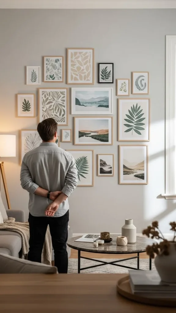
A perfectly styled gallery wall can change the entire mood of a room—instantly adding personality, warmth, and sophistication. But creating one that actually looks intentional (instead of cluttered or chaotic) can feel intimidating. The secret? A smart layout, simple spacing rules, and a few designer-approved tricks.
With a little planning, you can build a gallery wall that feels stylish, cohesive, and very chic. Let’s break it down step by step.
Choose Your Wall & Define the Mood
Before you even pick frames, take a moment to understand what you want your gallery wall to say. Is it bold? Minimal? Warm? Eclectic? The wall location matters too—some spaces naturally invite cleaner lines, while others allow for play.
Great places for gallery walls:
- Above a sofa
- Along a hallway
- Behind a bed
- Around a TV
- Staircases
Think of the vibe: soft neutrals for calming areas, bold contrast for creative zones, metallic frames for glam spaces.
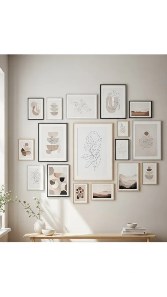
Gather Art That Feels Connected
A balanced gallery wall needs cohesion. Your prints don’t have to match, but they should share a common thread.
Here are easy ways to create visual harmony:
- Use a consistent color palette (neutrals, earth tones, black & white, pastels).
- Stick to one art style (abstract, photos, line art, botanical).
- Repeat frame colors (all black frames, gold frames, or mixed wood tones).
- Include a few pieces with the same subject theme.
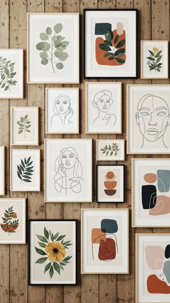
This step alone makes your final wall feel curated, not random.
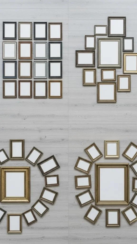
Start With a Layout on the Floor First
Designers never start by hammering nails straight into the wall. Instead, they lay the frames out on the floor first.
Why this works:
- You see the spacing clearly.
- You can shuffle pieces around without damage.
- You get a feel for balance and flow.
Start with your largest piece—it becomes the “anchor.” Build smaller frames around it like puzzle pieces, working outward.
Try these layout styles:
- Organic cluster: asymmetrical but balanced
- Structured grid: clean lines, perfect spacing
- Linear row: all frames at the same height
- Center-out layout: anchor in the middle, radiate outward
Master the Magic Spacing Rule
The biggest reason gallery walls look messy? Uneven spacing.
Interior stylists follow one extremely simple rule:
👉 Keep 2–3 inches of space between every frame.
This creates:
- Uniformity
- Breathing room
- Clean visual flow
Use painter’s tape or even a small cardboard spacer to keep distances even as you hang.
Hang Your Frames at the Right Height
A chic gallery wall sits at eye level, not too high or too low.
Ideal hanging height:
- Center of the grouping should be around 57–60 inches from the floor.
- For above furniture, leave 6–8 inches between the top of the furniture and the bottom of your lowest frame.
If you’re decorating a staircase, follow the angle of the steps and keep frame centers aligned diagonally for a smooth, elegant flow.
Mix Shapes, Sizes & Frame Styles for Depth
Variety makes a gallery wall fun. But variety needs structure to look professional.
Tips for mixing:
- Use one or two consistent frame colors to avoid visual overload.
- Include a long rectangular piece or round art to break up boxy shapes.
- Balance heavy pieces across the layout, not all on one side.
- Play with vertical vs. horizontal prints.
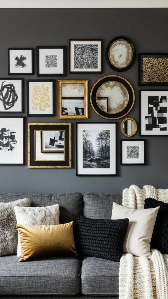
This creates a dynamic composition that still feels cohesive.
Add Dimension With Objects & Textures
Gallery walls don’t have to be just frames. Add texture to make it feel more curated.
Try:
- Small wall sculptures
- Decorative plates
- Mini shelves
- Woven pieces
- Brass or wooden accents
Even one or two layered accessories can make the wall pop.
Use Paper Templates for Perfect Placement
If you want zero mistakes, this technique is foolproof.
How to do it:
- Cut kraft paper to match the size of each frame.
- Tape the paper templates to the wall.
- Adjust until the layout feels right.
- Nail directly through the paper for perfect positioning.
- Remove the paper and hang the frames.
It saves time, stress, and holes in your wall.
Step Back & Check the Visual Weight
This is the final designer secret.
Stand 8–10 feet away and look at your wall:
- Is one side visually heavier?
- Are colors balanced?
- Does the eye travel smoothly across the arrangement?
Shift pieces as needed until the wall feels harmonious. Trust your instincts here.
Final Takeaway
A chic gallery wall isn’t about expensive art—it’s about thoughtful placement, consistent spacing, and cohesive styling. With a little preparation and the steps above, you can create a layout that feels polished, balanced, and incredibly stylish.
Save this guide for later and start planning your dream gallery wall today!
Leave a Reply