
Bold accent colours can completely transform a space when used well. They bring personality, energy, and visual excitement—but only if they’re balanced thoughtfully. Too much bold colour can overwhelm a room, while too little can feel disconnected. The key is intentional placement, curated palettes, and smart layering that allows bold tones to shine without competing.
Here’s how to use bold accent colours confidently, stylishly, and without creating chaos.
Start With a Neutral Base to Let Bold Colours Shine
Bold colours stand out best when paired with a clean, neutral foundation. This gives your décor breathing room and prevents the palette from feeling chaotic.
Great neutral foundations include:
- White or off-white walls
- Soft grey furniture
- Natural wood tones
- Cream or beige textiles
A neutral backdrop ensures your bold accents pop instead of compete.
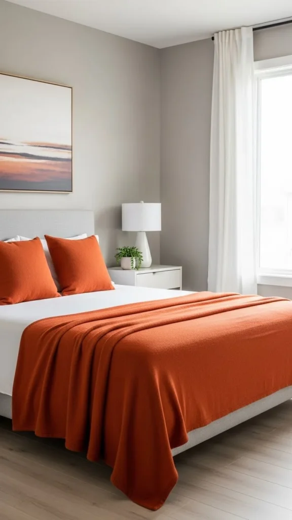
Choose One or Two Bold Accent Colours—Not Five
The secret to using bold colours stylishly is restraint. Choose one main accent colour and (optionally) a second supporting bold tone.
Some beautiful pairings include:
- Mustard yellow + deep blue
- Emerald green + blush pink
- Teal + gold
- Navy + burnt orange
- Fuchsia + charcoal
These combinations feel deliberate and harmonious rather than random.
Use the 60-30-10 Rule for Colour Balance
Designers love the 60-30-10 rule because it keeps rooms visually balanced while still allowing bold tones to shine.
Breakdown:
- 60% dominant colour (usually neutrals)
- 30% secondary colour (supporting tones)
- 10% bold accent colour
This formula ensures bold colours feel intentional without overpowering the room.
Add Bold Colours Through Swappable Decor Items
One of the easiest ways to experiment with bold shades—without long-term commitment—is by using removable or replaceable décor elements.
Add pops of colour through:
- Throw pillows
- Rugs
- Art prints
- Lamps
- Blankets
- Vases
- Books
- Planters
These pieces add vibrancy while keeping your space flexible.
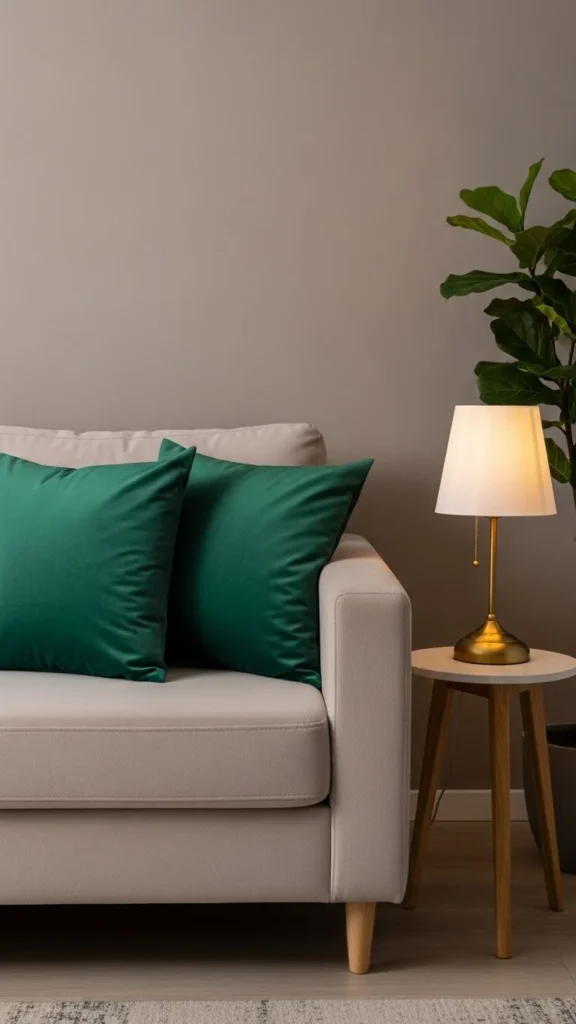
Repeat the Accent Colour at Least Three Times
To keep bold colours from looking random, repeat the same accent tone in multiple areas of the room.
For example, if your accent colour is mustard yellow, add:
- A mustard throw pillow
- A small mustard vase
- A piece of art with mustard accents
This repetition creates flow and cohesion.
Balance Bold Colours With Natural Elements
Natural elements help anchor bold colours and soften their intensity.
Try pairing bold accents with:
- Wood finishes
- Woven textures
- Plants
- Stone or ceramic décor
- Linen or cotton fabrics
Nature-inspired materials add calming balance to stronger hues.
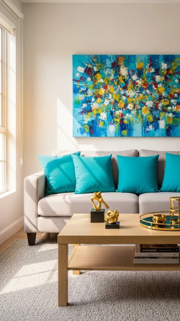
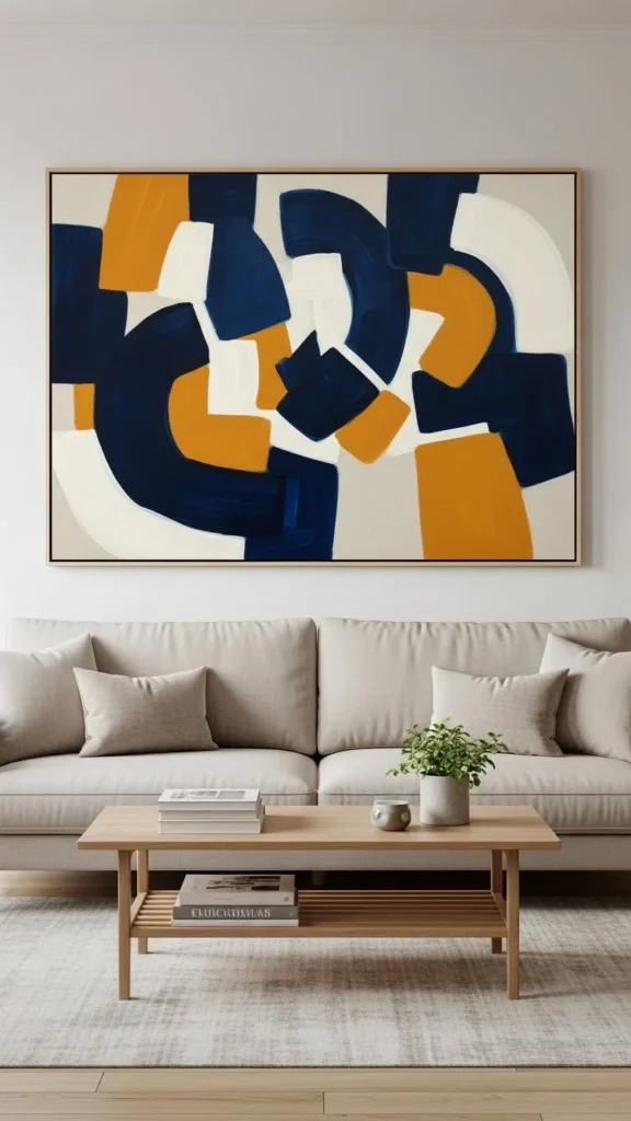
Use Bold Wall Art to Tie the Palette Together
Art is one of the most effective ways to introduce bold colour without clutter. A single statement piece can unify your accent tones across the entire room.
Choose artwork that includes:
- Your lead accent colour
- One or two complementary shades
- A mix of neutrals for balance
A bold art print becomes both a décor piece and a colour guide.
Choose Bold Colours That Complement Your Lighting
Lighting changes how bold colours appear. Before committing, see how your chosen accent colour looks:
- In morning natural light
- During golden hour
- Under warm indoor bulbs
- At night under soft lamp lighting
Warm lighting enhances earthy tones like terracotta and mustard, while cool lighting enhances vibrant blues and greens.
Use Patterns to Introduce Bold Colours Gently
If solid bold colours feel too intense, introduce them through patterns.
Smart pattern choices:
- Botanical prints
- Geometric shapes
- Abstract florals
- Striped rugs
- Patterned throw pillows
Patterns blend bold tones with softer ones, making the colour feel approachable and balanced.
Avoid Mixing Too Many Saturated Shades
Bold colours lose impact when surrounded by too many competing bold tones. Stick to one hero shade and let others play supporting roles.
Avoid:
- Bright red + bright yellow + bright blue (too chaotic)
- Neon tones mixed together
- Clashing undertones (warm vs cool fighting each other)
Cohesion is everything.
Final Takeaway
Bold accent colours don’t have to clash or overwhelm your space. With a neutral base, thoughtful repetition, smart colour choices, and strategic placement, you can create vibrant décor that feels modern, stylish, and beautifully balanced.
Save this article for later so you can start decorating with bold colours confidently!
Leave a Reply