
Shelves often sit in plain sight, yet they’re easy to overlook when decorating. Spring is a good time to reset shelf styling so it feels lighter, calmer, and more intentional. Designer-style shelves don’t rely on expensive objects or crowded displays. They come together through spacing, repetition, and thoughtful editing. These ideas focus on polished spring shelf decor that looks refined while staying practical, affordable, and easy to adjust as your home changes.
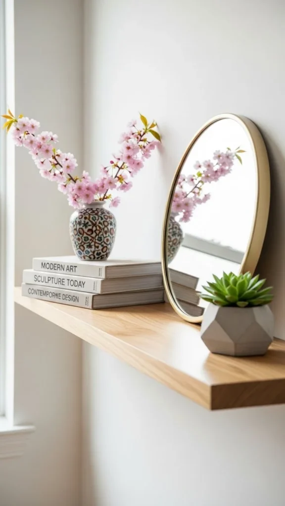
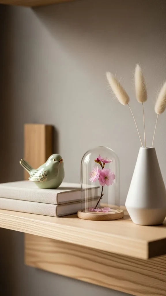
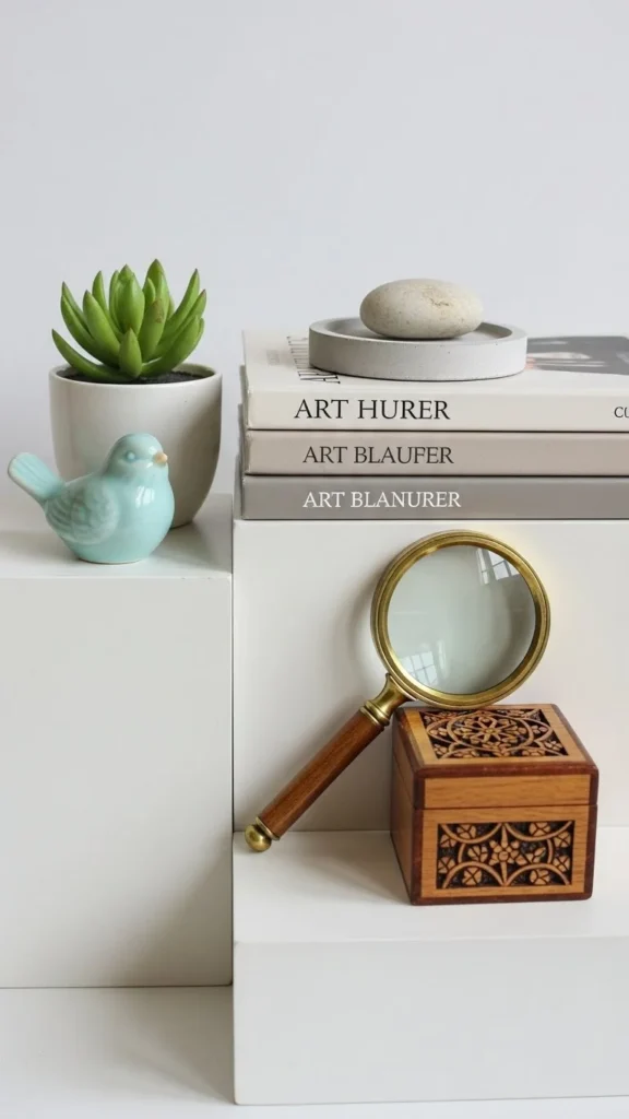
1. Neutral Book Stacks as a Base
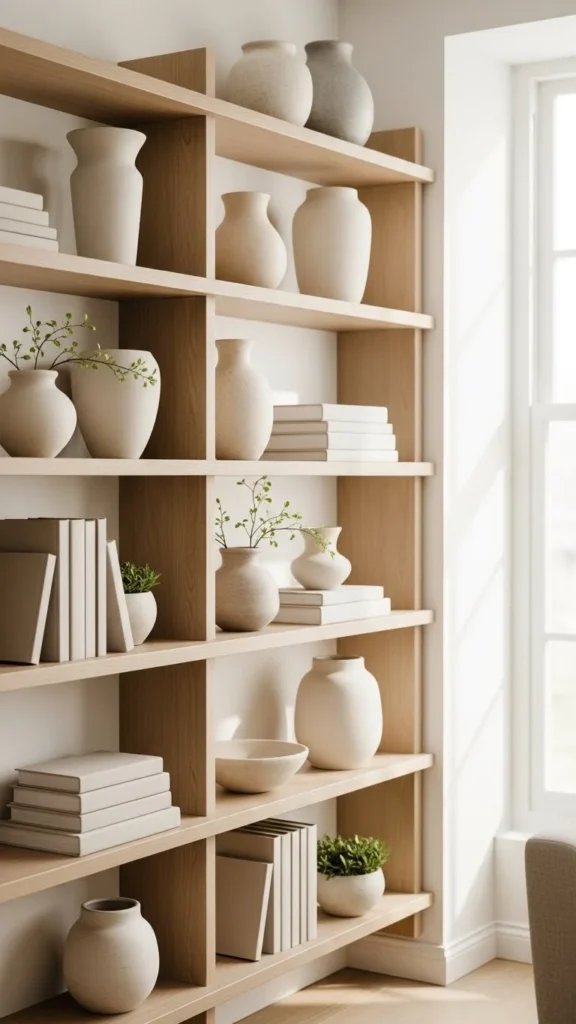
Books create structure on shelves and help anchor decorative items. Choose covers in whites, beiges, or muted tones. Remove dust jackets if needed for a calmer look.
Stack books horizontally to create a base for small objects like bowls or vases. Two or three books per stack are enough. Avoid filling the entire shelf with books. Negative space matters.
Budget tip: thrift stores are great for finding hardcover books in neutral colors. Book layering adds height and balance without clutter.
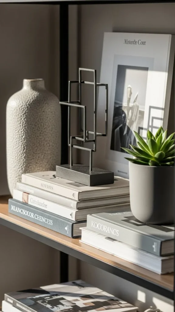
2. Single Statement Object per Shelf
Designer shelves often feature restraint. Instead of filling every shelf, choose one standout object for certain sections.
Look for sculptural ceramics, stone pieces, or simple art objects. Center them or place slightly off-center for visual interest.
This approach works especially well on narrow shelves. Intentional simplicity helps shelves feel curated rather than crowded.
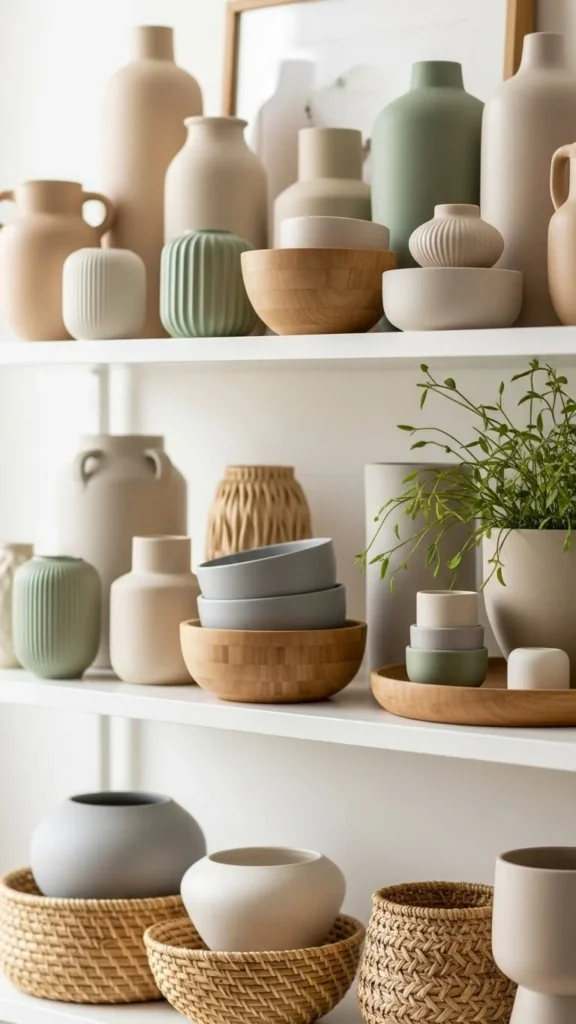
3. Repeating Color Tones
Repeating the same color across shelves creates cohesion. Choose one or two tones and use them throughout.
This might mean repeating white ceramics or light wood accents. Variation comes from texture, not color.
You don’t need matching items. Similar tones are enough. Color consistency keeps shelves visually calm.
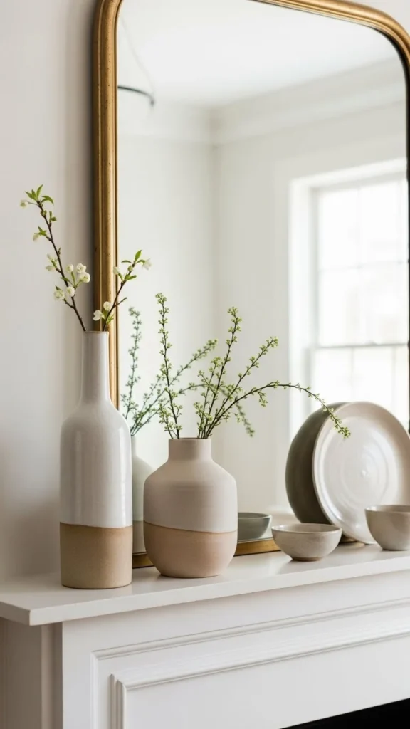
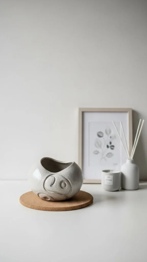
4. Low Ceramic Bowls
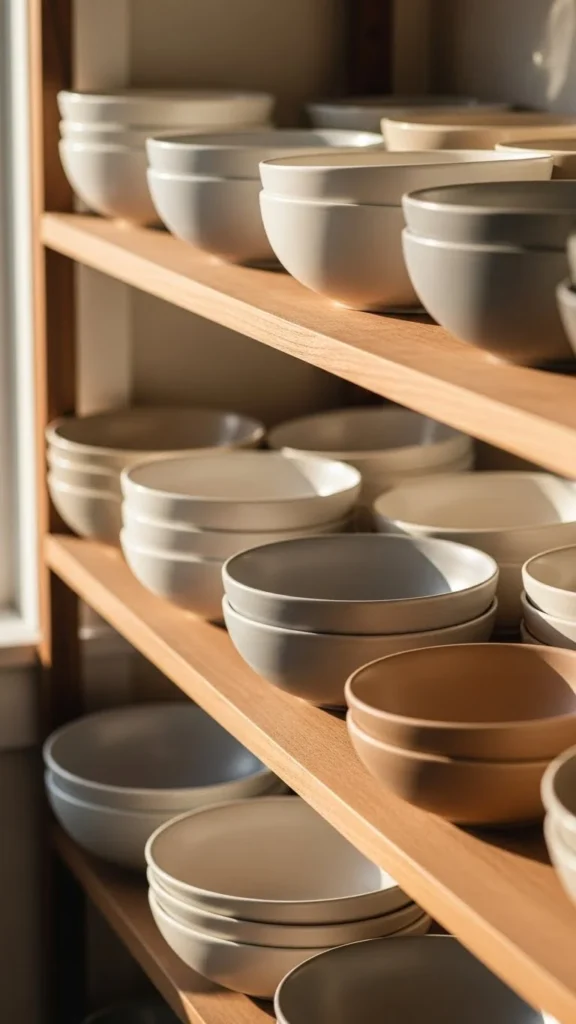
Low bowls work well because they don’t block sightlines. Use them alone or stacked on books.
Choose matte finishes in light tones. Avoid overly decorative patterns.
Thrifted bowls often add subtle character. Low-profile decor supports a balanced look.
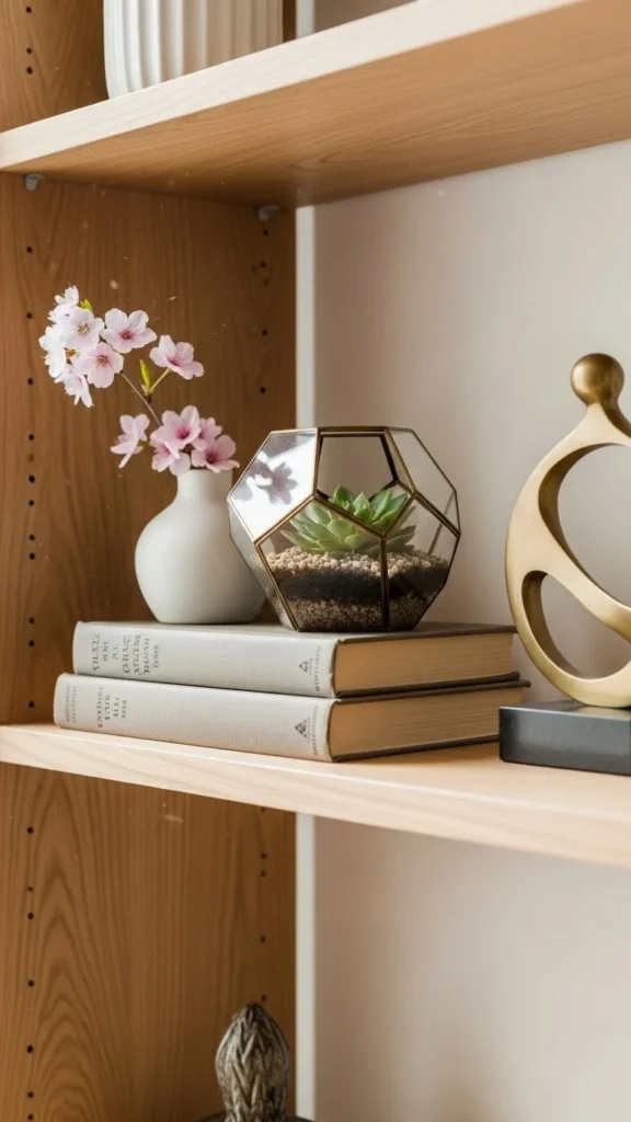
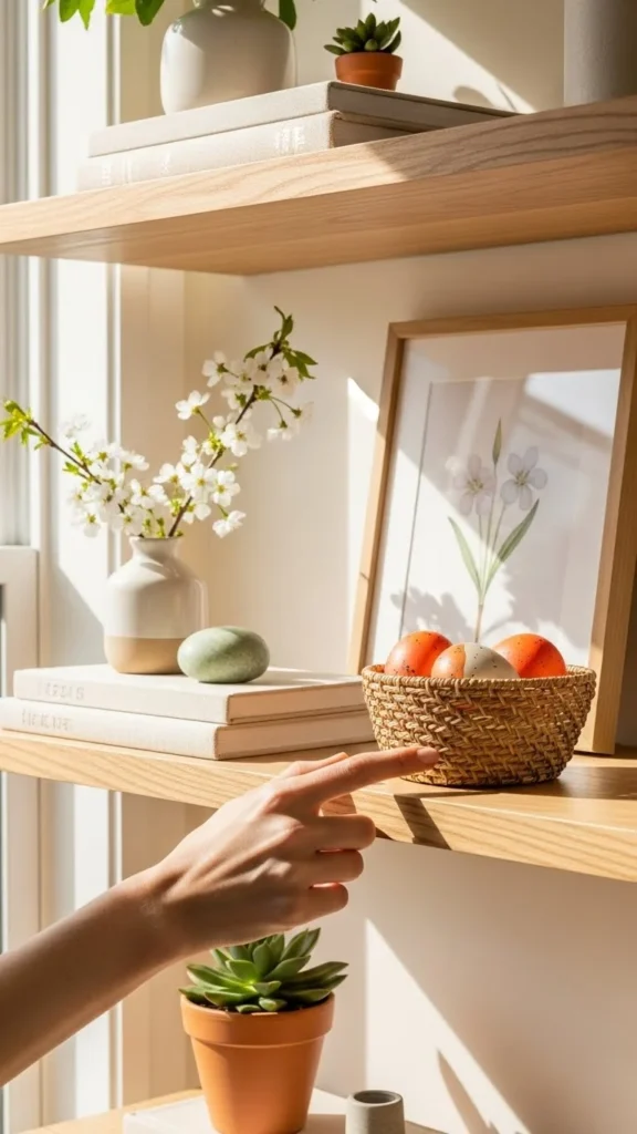
5. Small Greenery with Soft Shapes
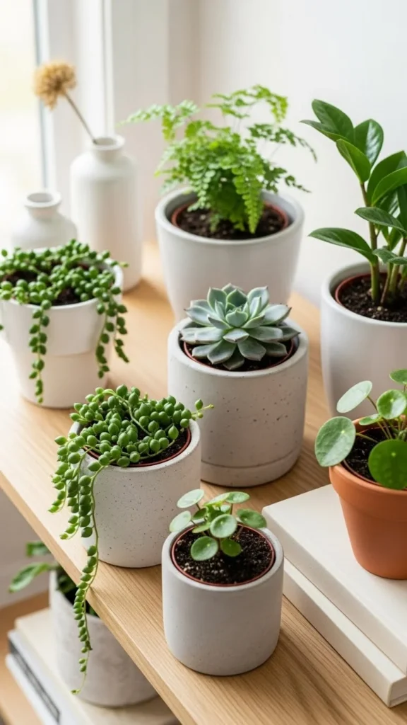
Greenery adds life, but shelves look best with restraint. Use small plants with rounded leaves.
Neutral planters keep the look refined. Faux plants work if light is limited.
One plant per shelf section is usually enough. Controlled greenery feels intentional.
6. Vertical and Horizontal Mix
Designer shelves mix orientations. Pair vertical objects like vases with horizontal stacks like books.
This creates movement without chaos. Keep quantities low so each item stands out.
Directional contrast adds interest without clutter.
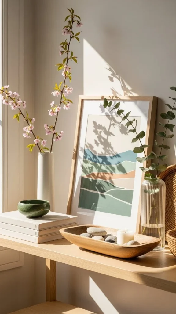
7. Framed Art Leaned Back
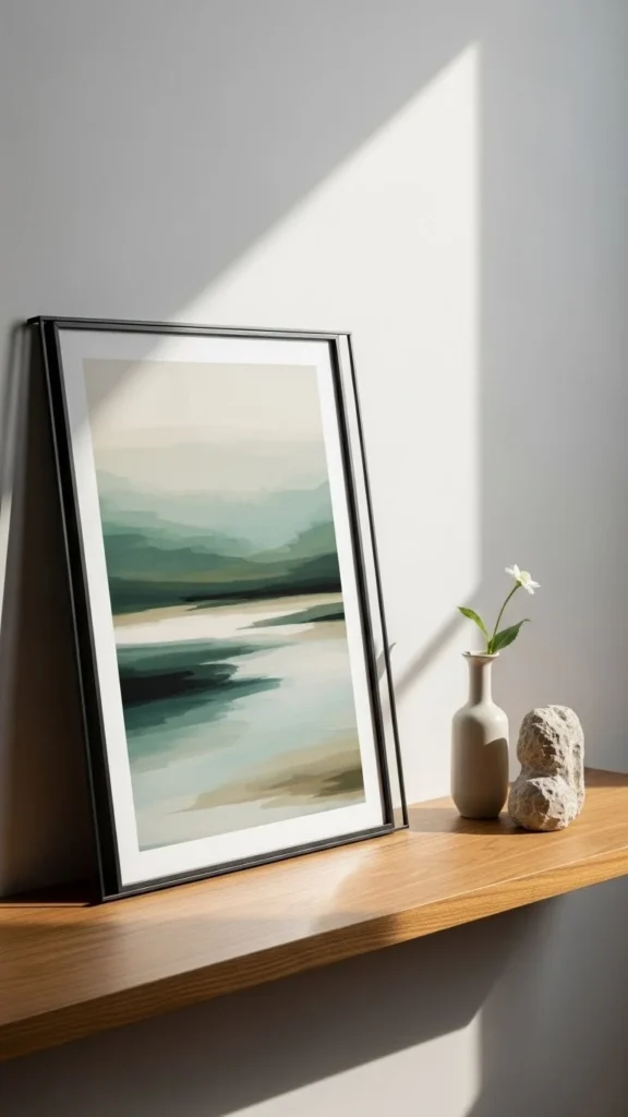
Leaning frames feel relaxed and flexible. Use small or medium frames behind other objects.
Choose simple art with calm tones. Light frames work best.
This method allows easy swaps without nails. Casual layering adds depth.
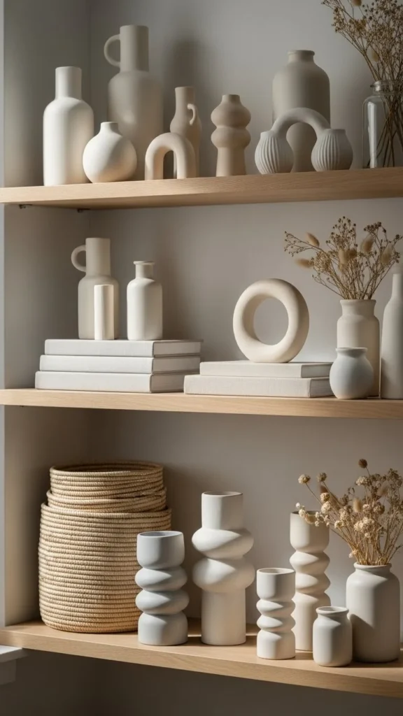
8. Sculptural Objects with Texture
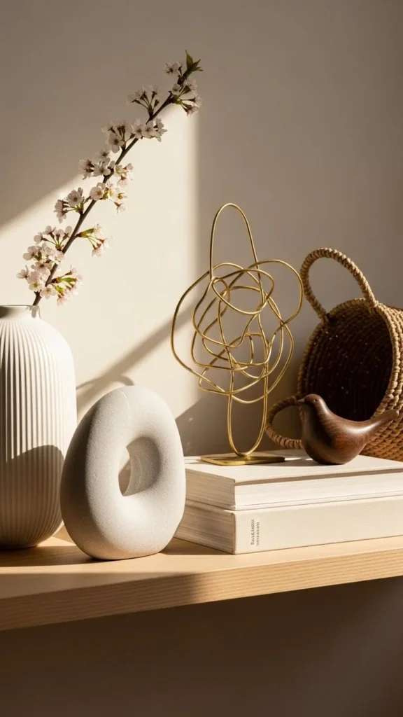
Texture adds interest where color is limited. Look for ceramics, stone, or plaster finishes.
Stick to one or two textured pieces per shelf. Too many can feel heavy.
Tactile surfaces bring warmth quietly.
9. Open Space Between Objects
Spacing matters as much as decor itself. Leave room around each item.
This helps shelves feel organized and easier to read visually.
Resist the urge to fill gaps. Breathing room is part of polished styling.
10. Light Wood Accents
Light wood warms shelves without darkening them. Use small trays, boxes, or frames.
Repeat wood tones across shelves for cohesion.
Natural finishes pair well with neutral decor.
11. Grouped Objects in Threes
Groups of three feel balanced. Mix sizes slightly while keeping tones similar.
This works well for small objects like vases or candles.
Odd-number groupings add visual ease.
12. Minimal Decorative Boxes
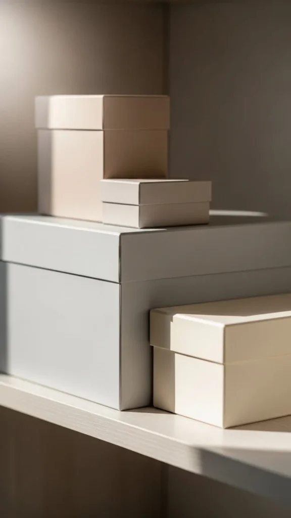
Decorative boxes hide small items while adding structure. Choose simple shapes.
Stack one or two boxes or place them beside books.
DIY option: cover old boxes with neutral paper or fabric. Hidden storage decor keeps shelves tidy.
13. Repeated Shapes
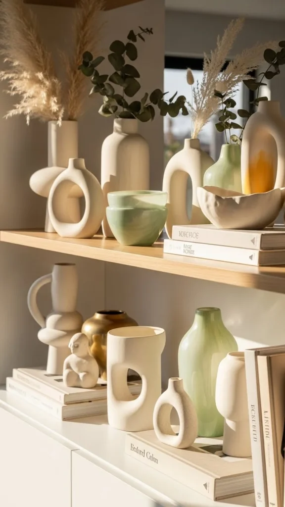
Repeating shapes creates rhythm. Use similar curves or silhouettes across shelves.
This can mean several rounded bowls or cylindrical vases.
Shape repetition brings subtle harmony.
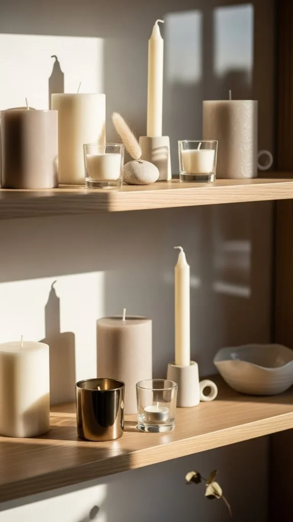
14. Neutral Candles as Accents
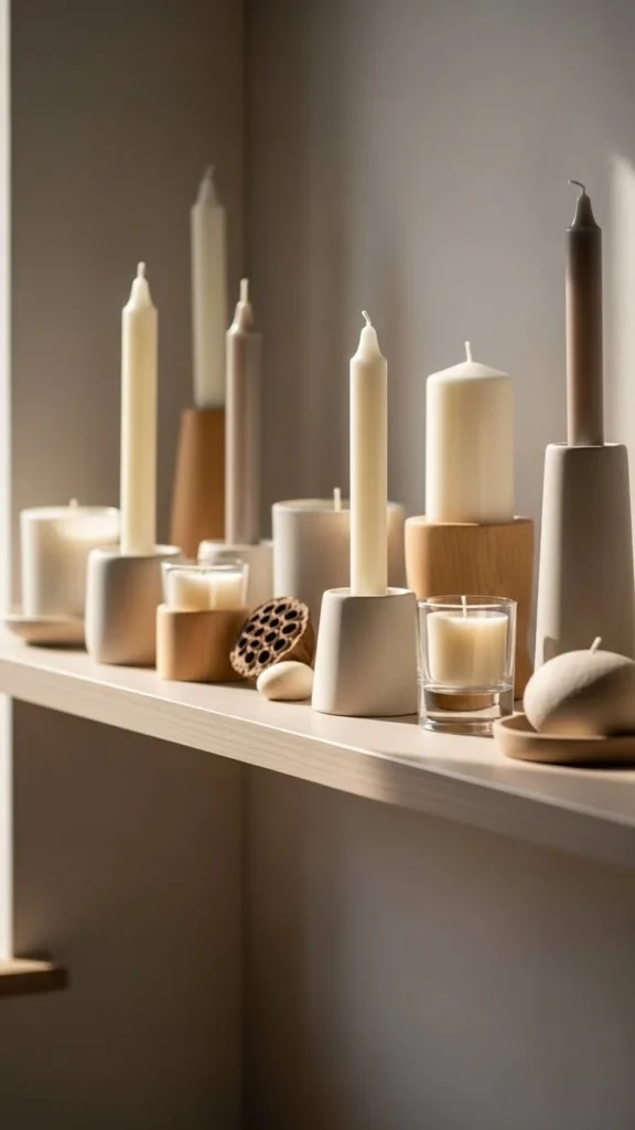
Candles add warmth even when unlit. Choose neutral colors and simple holders.
Limit candle groupings to one area.
Soft accents support a calm shelf display.
15. Small Personal Objects Edited Carefully
Personal items add meaning, but editing matters. Choose one or two meaningful pieces.
Surround them with neutral decor so they stand out.
Intentional personal touches feel thoughtful, not cluttered.
16. Matte Finishes Only
Matte surfaces reduce glare and feel calmer. Avoid shiny or glossy finishes.
This keeps shelves visually consistent.
Soft finishes support a refined look.
17. Asymmetrical Shelf Styling
Perfect symmetry isn’t required. Asymmetry often feels more natural.
Cluster decor to one side and leave the other side open.
Uneven balance keeps shelves relaxed.
18. Limited Color Palette Per Shelf
Limit each shelf to one or two colors. This avoids visual overload.
Repeat those colors elsewhere for cohesion.
Color restraint keeps shelves polished.
19. Books Turned Spine-In
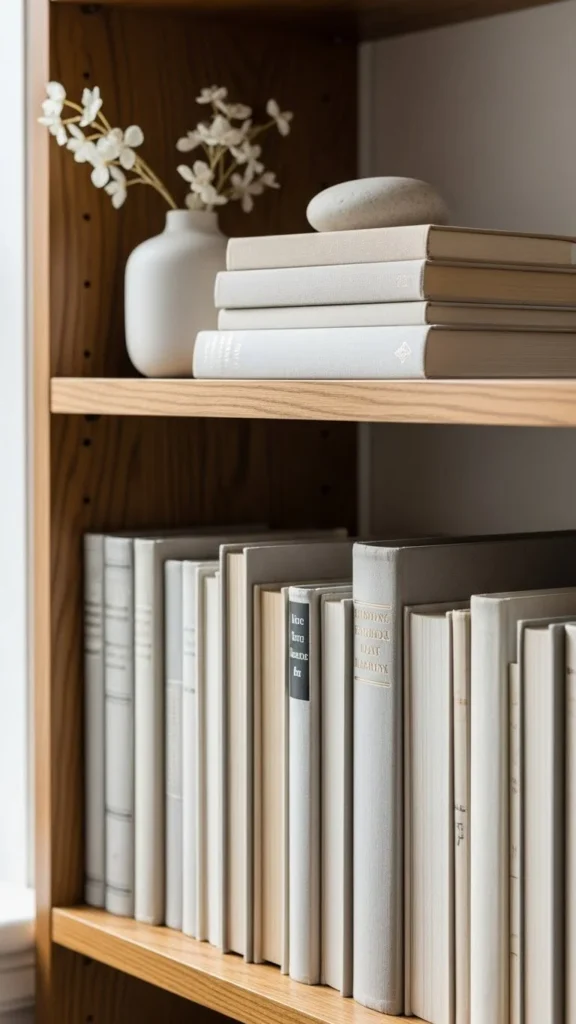
Turning book spines inward creates a calm backdrop. This works well when covers are colorful.
Mix with a few spine-out books if desired.
Muted book displays keep shelves cohesive.
20. Small Art Objects on Risers
Risers add height variation. Books work well as risers.
Place one small object on top.
Layered height adds interest subtly.
21. Seasonal Shelf Rotation
Instead of adding more decor, rotate what you own.
Store unused items and swap a few pieces seasonally.
Thoughtful rotation keeps shelves feeling current.
22. Final Shelf Edit for Balance
Step back and edit. Remove anything that feels distracting.
Shelves often look better with fewer items.
Ongoing editing maintains a designer-style finish.
Conclusion
Polished spring shelf decor comes from restraint, repetition, and careful spacing rather than expensive pieces. Neutral tones, simple shapes, and thoughtful editing help shelves feel balanced and refined. Start with one shelf, adjust slowly, and trust negative space. These ideas show how everyday objects can come together in a way that feels intentional and easy to live with all season long.
Leave a Reply